How to give design feedback that gets you a better next round: a short checklist for clients, a comment formula, and real examples rewritten.
Table of contents
TL;DR: Good design feedback says what you noticed, where it is, and why it matters for what the design has to do. Describe the problem, not the fix. Put each comment on the spot it's about, collect everyone's notes into one round, and say how important each one is. That's the whole method.
The checklist, in one glance:
- Reread the goal first.
- React as your customer, not as yourself.
- Say what, where and why.
- Describe problems, not solutions.
- Mark each note: must fix, nice to have, just a thought.
- Say what's working, specifically.
- One round, one place, everyone's notes.
- Reply within a few days.
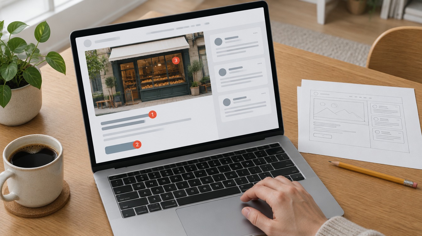
The proof lands in your inbox. It's close, but something is off. You have ten minutes before your next call, so you type "can it pop a bit more?" and hit send. Two weeks later you're on round four, and nobody can say what "pop" meant.
Learning how to give design feedback fixes this, and it takes less effort, not more. The trick is a format. Say what you noticed, where it is, and why it matters. Then put it in one place.
This page is written for you, the client. If your designer sent you the link, that's on purpose: it's meant to be forwarded. And if you're the one asking for feedback, start with the companion guide on asking.
What good design feedback is
Feedback a designer can use is a reaction tied to the design's goal and to a specific spot, with the reason attached. It doesn't need design words. It needs a where and a why.
Useful design feedback names what you noticed, where it is, and why it matters for what the design has to do. "The headline is hard to read over the photo, and it's the first thing our customers see" is useful. "Make it pop" is a feeling.
The reason matters more than the request. A designer can solve a problem a dozen ways. They can only follow an instruction one way, and it might be the wrong one.
Say you write "make the logo bigger." The designer makes it bigger. But your real worry was that people wouldn't know whose site they were on. A clearer tagline might have fixed that better than a larger logo. The designer never got the chance to suggest it.
Reality Check: Your designer isn't offended by a clear "this isn't working." Vague is what hurts. Vague feedback turns into extra rounds, and extra rounds cost you time or money.
The checklist you can forward
Run through these eight before you reply. It takes about two minutes and usually saves a whole round.
Reread the goal first. What is this design for? Selling the spring line, getting sign-ups, looking premium. Judge the proof against that goal, not your taste. Example: "The goal was more sign-ups, and the sign-up button is below the fold on my phone."
React as your customer, not as yourself. You are probably not the audience. Designer Nela Dunato's client guidelines put it simply: put yourself in your target customer's shoes. Example: "Our customers are mostly retirees, and the body text feels small for them."
Say what, where and why. Every note needs all three parts. The next section shows the formula in full. Example: "The price is hard to find on the product card, and price is the first thing our buyers check."
Describe problems, not solutions. "I can't find the price" beats "move the price up and make it red." The first leaves room for a better fix than yours. Example: "I scrolled past the phone number twice before I spotted it."
Pro Tip: If you catch yourself typing an instruction like "make it bigger," add the reason after it. Then delete the instruction and read the reason on its own. It usually still works, and it leaves room for a better fix.
Mark how important each note is. Tag every comment: must fix, nice to have, or just a thought. Those words stop a passing comment from turning into a redesign. Example: "The footer feels busy. Just a thought."
Say what's working, specifically. Skip "love it." Name the thing you love, so the designer knows what to protect in the next round. Example: "The photo choice is exactly our customer. Please keep it."
One round, one place, everyone's notes. Collect your team's reactions first, settle the contradictions yourself, then put every note on the spot it's about. More on this below. Example: "Here are all our notes from the team, on the proof itself."
Reply within a few days. Both of you still remember the details. A reply three weeks later lands on someone who has moved on to other work. Example: "Sending notes today. The rest of the team will add theirs by Thursday."
The comment formula: what, where, why
Every useful comment has three parts: what you noticed, where it is, and why it matters for the goal. A fourth part, how important it is, is optional. It saves a lot of back-and-forth.
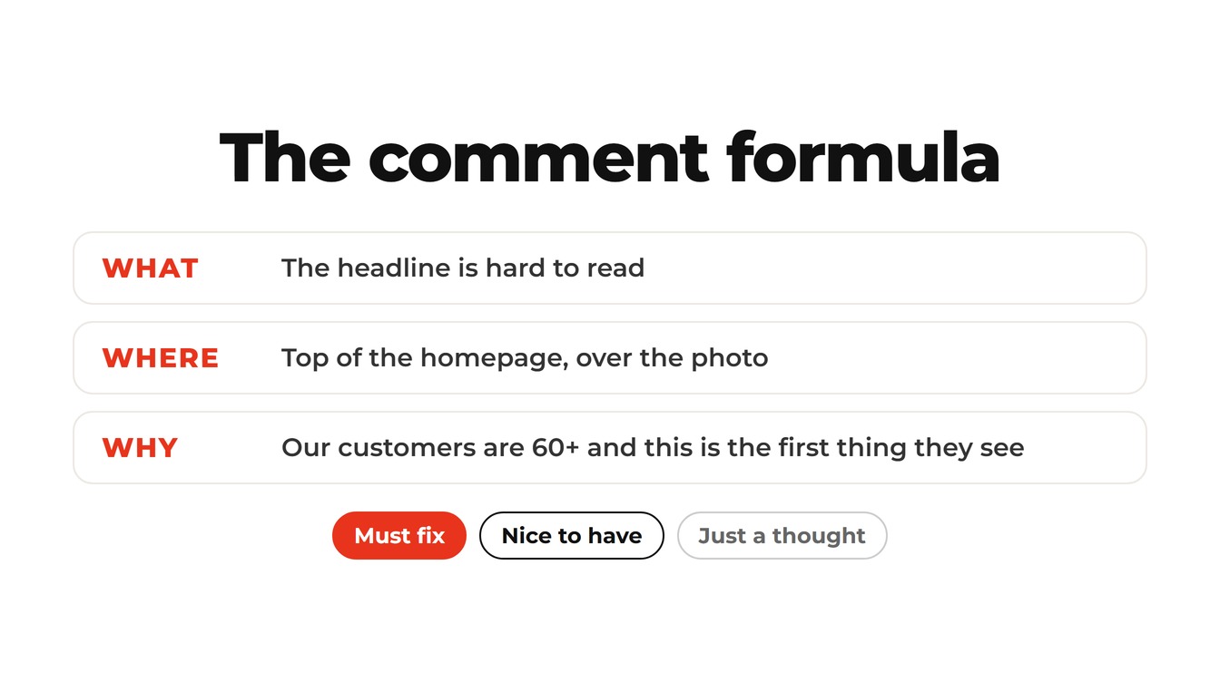
Here it is as a fill-in line you can copy:
[What] at [where], because [why]. (Must fix / Nice to have / Just a thought)
Two worked examples:
- Website: "The headline is hard to read, at the top of the homepage over the photo, because our customers are 60+ and this is the first thing they see. Must fix."
- Print flyer: "The phone number is small, in the bottom corner, because most people call us instead of visiting the site. Nice to have."
Neither comment tells the designer what to do. Both say exactly what's wrong and how much it matters.
Key Insight: The "why" is the part your designer can act on. Two comments with the same "what" and different "why"s lead to different fixes. "The headline is small, because our customers have poor eyesight" and "the headline is small, because it gets lost next to the photo" need two different changes.
Bad feedback, rewritten
Here are six common reactions, written so a designer can act on them. The left column is what most of us type first. The right column is what to send.
| What you were going to type | What to send instead |
|---|---|
| Make it pop | The page feels flat next to our competitors' sites. The hero photo is dark and the headline is grey. Nice to have. |
| I don't like the blue | The blue reads as corporate and we're a family bakery. Warmer would fit the brand. Must fix. |
| Can the logo be bigger | I'm worried people won't see who we are. On the homepage the logo is smaller than the menu text. Just a thought. |
| This doesn't feel like us | Our brand is playful and this layout feels formal: the serif font and the symmetry. Must fix. |
| Looks great! | The photo choice is exactly our customer, and the pricing table is clear. Keep both. |
| My wife thinks the font is boring | One reader found the body font plain. Not a priority for me unless you agree. Just a thought. |
Look at what changed in each row. Every rewrite adds a where, a why and a weight. None of them adds design jargon. You don't need to know what kerning is to write the right-hand column.
Watch Out: Don't forward other people's reactions raw. "My business partner hates it" gives the designer nothing. Translate the reaction with the formula, or leave it out.
Put it on the spot, in one place
A comment attached to the exact spot it's about is clearer than any paragraph in an email. One place for everyone's notes stops contradictions from ever reaching the designer.
Picture a normal review round. There's an email thread with three replies. Someone sends a screenshot with red circles on it. The CEO posts in Slack. Then someone says "let's hop on a call." The designer now has four sources of notes, and two of them disagree about the headline.
The rule that fixes this is short. One round, one link, every note pinned to the spot. Settle your team's disagreements before the designer sees them. If several people review your work, here's how agencies review in one place.
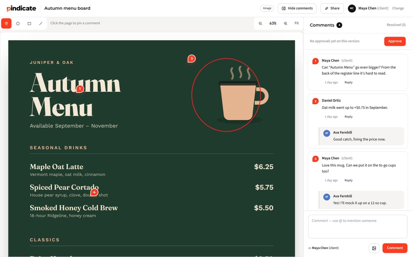
Pindicate is our tool, built for exactly this step. Your designer sends a link. You open it, type your name and click the spot you mean, then write your comment right there. No account, no app. You can open a sample review and try leaving a comment to see what that's like, or read how Pindicate works.
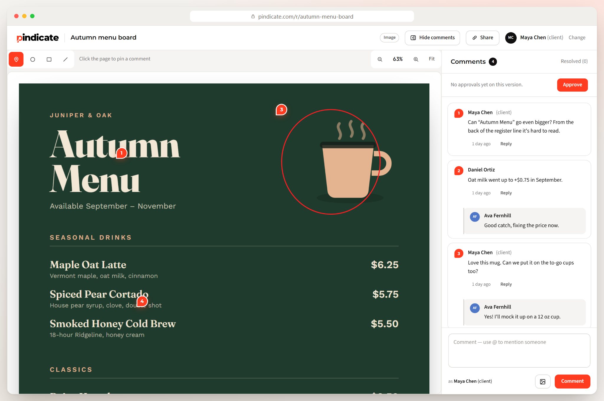
Whatever tool your designer uses, the idea holds: notes live on the design, not in five inboxes.
Quick Win: Before you send, read your notes as a list. If two of them contradict each other, pick one. That single check is the biggest time-saver in any review round.
Can I ask for changes I'm not sure about?
Yes. Say it's a question, not an instruction, and mark it "just a thought." The designer can then say yes, no, or "here's why I did it that way."
It's also fine to disagree with your designer. Say what worries you and why, then ask what they would do about it. "I'm not sure the dark background fits a kids' brand. What would you suggest?" opens a conversation. "Change the background" closes one.
You're not the first client to wonder about this. A client asked almost exactly that on Graphic Design Stack Exchange, in a thread titled "How can I best provide feedback to my designer". Designers talk about the other side of it on Reddit, in "How do you help your clients give feedback?" on r/graphic_design.
If you're the designer
Send this page with the proof, and ask three specific questions instead of "what do you think?"
Designer Nela Dunato makes the case plainly in her article on encouraging constructive design feedback:
"You need to teach your clients how to give useful feedback."
Three habits make that easy:
- Send the checklist with the first proof. A link to this page in the email sets the format before the first comment arrives.
- Ask three questions. "Does the headline say what we do?" gets a better answer than "thoughts?" There are ready-made question lists in how to ask for feedback on a logo.
- Give one place to answer. Upload the proof and get a link so every note lands on the design. Pindicate for freelancers covers how that works for a one-person studio.
Frequently Asked Questions
How do I give feedback to a designer without being rude?
Be specific and give the reason. "The headline is hard to read over the photo, and it's the first thing customers see" is not rude. It's useful. Rude is "this is bad" with nothing a designer can act on. Say what's working too, and name it, so the designer knows what to keep in the next round.
What should design feedback include?
Three things: what you noticed, where it is, and why it matters for what the design has to do. Add how important it is, using must fix, nice to have or just a thought. With those four parts, the designer can plan the next round instead of guessing which notes matter most.
Should I tell the designer how to fix it?
Describe the problem and let them propose the fix. "I can't find the price" gives the designer options. "Make the price red" gives them one, and it may not be the best one. If you have a strong idea, share it as a suggestion and include the reason behind it.
How do I collect feedback from my whole team?
Gather everyone's notes before replying, settle the contradictions yourself, and send one round with each note on the spot it's about. A shared review link where everyone comments in the same place, like Pindicate, does the collecting for you. The designer then gets one clear set of notes, not four.
Can I post the draft on social media to get opinions?
Ask your designer first. Until the final invoice is paid, the designer usually owns the work, and public drafts can be copied. If they agree, ask specific questions instead of "what do you think?" Treat the replies as one input among several, not as a vote that decides the design.
How fast should I reply to a design proof?
Within a few days. The design is fresh in the designer's mind and your reactions are fresh in yours. A reply three weeks later restarts the conversation, and settled points often get argued again. If your team needs longer, send a quick note saying when the full feedback will arrive.
Try it on a real design
If you're the client, open a sample review and try leaving a comment. Click a spot, then write a what-where-why note. It takes two minutes and needs no account.
If you're the designer, upload your next proof and get a link, then send it with this page. Your client gets the checklist and one place to answer. For more on running smooth review rounds, browse more guides.